PowerPoint is where most org charts are born. It's already open, everyone knows it, and for a small, stable team it makes a clean chart in minutes. It's also where a lot of those charts get stuck, rebuilt by hand every time someone joins, leaves, or moves. This guide shows you exactly how to make an org chart in PowerPoint with SmartArt, and then the honest part: when to stop and switch to something built for the job.
We make org chart software (OrgPlease!), so treat us as biased. But the PowerPoint steps below are real and complete. Use them, they work. The "when to stop" section is the other half of the story, and the reason we're happy to show you the manual way first.
Method 1: SmartArt (the fastest way)
SmartArt is PowerPoint's built-in tool for hierarchy diagrams. The full process:
- Insert the graphic. On the Insert tab, click SmartArt, then pick the Hierarchy category. Organization Chart is the standard layout.
- Open the text pane. With the SmartArt selected, click the small arrow on its left edge (or use the Design tab, then Text Pane). You get a bulleted outline to type into, which is faster than clicking each box.
- Type your people. Each bullet is a box. The top bullet is your top person. Press Enter for a new box at the same level.
- Set the hierarchy with Tab. To make someone report to the person above them, put your cursor on their line and press Tab to demote them one level. Shift+Tab promotes them back up. That's how you build the reporting structure.
- Add titles. Put the name on the first line of a box and the title on a second line: in the text pane, press Shift+Enter inside a bullet for a soft line break, then type the title.
- Style it. Use the SmartArt Design tab for colors and the Format tab to adjust individual boxes. Keep it simple. Readable beats decorated.
One workflow note: SmartArt re-flows the whole diagram every time you add or move a box, so build the structure first and style it last. Style early and you'll spend the afternoon reformatting boxes that keep shifting.
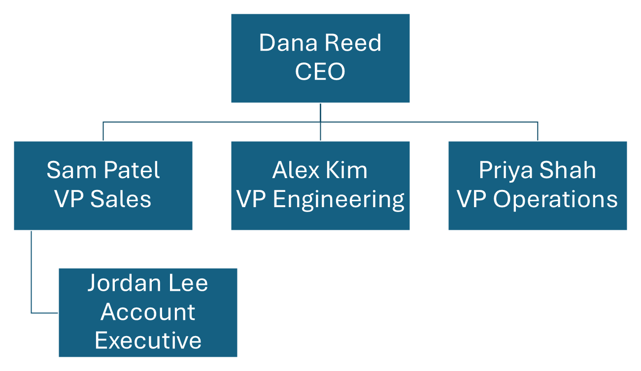
That is the default Organization Chart layout with nothing restyled: five boxes, built entirely from the text pane using Tab and Shift+Tab.
That's the whole method. For a team of 10-30 people, you can have a presentable chart in 10-15 minutes. Where it slows down is anything that isn't a clean top-down tree. The moment you need a dotted-line report, someone who answers to two managers, SmartArt fights you and you end up drawing the lines by hand anyway.
Method 2: Manual shapes (more control, more work)
If SmartArt's layouts feel too rigid, you can build a chart from individual shapes:
- Insert a rectangle (Insert, then Shapes) and place one box per person.
- Add text to each box by clicking and typing.
- Draw connector lines (Insert, then Shapes, then Lines) from each manager down to their reports.
- Tidy everything with the alignment tools (Format, then Align).
This gives you total visual control but takes much longer. Every box and every line is manual, so any change means moving things by hand. Use it only when SmartArt genuinely can't produce the layout you need.
Tips for a chart that looks professional
- Keep boxes uniform. Same size, color, and font. Uneven boxes just read as a mistake.
- Limit colors. One accent plus a neutral is plenty. A rainbow chart is hard to read.
- Don't overcrowd. If the chart won't fit legibly on one slide, treat that as a signal (more on that below). Shrinking the font to 6pt only hides the problem.
- Use consistent spacing. SmartArt handles most of this for you. With manual shapes, lean on the Align tools.
When to stop making org charts in PowerPoint
Here's the honest part. PowerPoint is fine for a chart that rarely changes. It stops being fine, and starts costing you real time, when any of these are true:
- You've rebuilt the same chart several times this year. Every reorg, hire, or departure means reopening the file and dragging boxes around again. Once you've done that five or six times, the manual approach has stopped saving you anything.
- Nobody's sure which version is current. "Org Chart FINAL v3" lives in an email thread, a shared drive, and someone's desktop, and none of the three match. Static files drift out of date the moment the team changes.
- The chart no longer fits on one slide. Past roughly 40 to 80 people, a readable single-slide chart gets genuinely hard, and you end up splitting it across slides or shrinking the text past the point anyone can read it.
- You need to share it widely or keep it current. Emailing a screenshot sends a snapshot that's out of date the day you send it. A live, linkable chart fixes that. A slide can't.
For most growing teams, the tipping point lands somewhere between 40 and 80 people. Below that, PowerPoint is reasonable. Above it, you're spending real time fighting the tool.
What to switch to
The alternative to drawing a chart by hand is generating it from your team's data. Instead of boxes you place yourself, you provide a list (name, email, and manager's email), and the tool builds the hierarchy for you. When someone moves, you change one row in the data and the chart redraws itself. You never drag a box again.
That's what a tool like OrgPlease! does. You upload a roster (an Excel or CSV file, including the kind your HR system exports), get a clean chart in about 60 seconds, share a live link, and export it in whatever format your deck needs. For a PowerPoint audience, the part that matters most is that export. Alongside a branded, vector PDF, you can export a native, editable PowerPoint deck: every person arrives as a real PowerPoint shape you can move, recolor, and restyle, rather than a flat screenshot pasted onto a slide. You keep the generated-from-data workflow and get a .pptx you go on editing in PowerPoint. It's free up to 25 people (free exports carry a small watermark). We build the thing, so weigh that as you like, but the shift from drawing a chart to generating it from data is the whole reason to switch. For the editable-export walkthrough, see export an org chart to PowerPoint. For the deeper how-to on the data side, see how to make an org chart from a CSV file.
Moving over is quick. If your team already lives in a spreadsheet, you export those three columns and upload them. Starting from scratch, you can grab the free org chart template and fill it in. From there the tool does the drawing, and you maintain the data instead of the diagram.
Bottom line
For a small, stable team, PowerPoint's SmartArt makes a perfectly good org chart in about fifteen minutes, and now you know how. The moment the team starts changing often, that same method turns into a standing chore and the chart is always a little out of date. That's the signal to stop drawing the chart and start generating it from your data. Until you hit that point, SmartArt has you covered.
When PowerPoint stops working: upload your team, get a living org chart in about 60 seconds, and drop it into your slides as a native, editable PowerPoint deck (or a branded PDF). Free up to 25 people. Start your free org chart
Related reading: Lire cet article en français · Export an org chart to PowerPoint · How to make an org chart from a CSV file