Most org charts end up in a slide deck. The board pack, the all-hands, the reorg proposal, the new-hire onboarding — sooner or later someone needs the chart in PowerPoint, next to everything else. So people rebuild it there by hand: drag a box, type a name, draw a line, repeat. It works for a dozen people. It falls apart well before a hundred.
There's a faster path. Generate the chart from your employee roster, then export it as a native, editable PowerPoint deck — every person a real shape you can move and restyle, not a flattened screenshot. This is how that works, and when it's worth doing instead of drawing in SmartArt.
Why teams want the org chart in PowerPoint
It's rarely about PowerPoint itself. It's about where the rest of the material already lives. The quarterly board deck is in PowerPoint. The strategy offsite is in PowerPoint. The onboarding walkthrough is in PowerPoint. When the org chart has to sit on slide 14 between the headcount plan and the budget, exporting a standalone PDF doesn't help — you need it inside the deck, on the same slide master, in a format you can nudge to match the template.
So the real requirement isn't "a picture of the chart." It's a chart that arrives as slides you can actually edit — resize a box, recolor a division, drop a note next to a role — without it looking pasted-in.
The SmartArt trap
PowerPoint has a built-in answer: SmartArt, plus its organization-chart layout. For a small team it's fine. You add boxes, promote and demote them, and PowerPoint arranges the hierarchy. The trouble starts as the org grows.
Past roughly forty people, hand-built org charts in SmartArt turn painful. The layout crowds, boxes shrink to fit, and rearranging one branch reshuffles the rest. Worse is the maintenance: every join, exit, and manager change means finding the right box and editing it by hand. Within a quarter you have three files — the deck from last board meeting, a copy someone "fixed," and the one that's actually current — and no reliable way to know which is which. The chart drifts out of date the moment you close the file.
The faster way: generate it, then export editable PowerPoint
The shortcut is to stop drawing the chart and start generating it. You already have the data — a roster with names, emails, and who reports to whom. Feed that in, let the tool build the hierarchy, then export the result to PowerPoint.
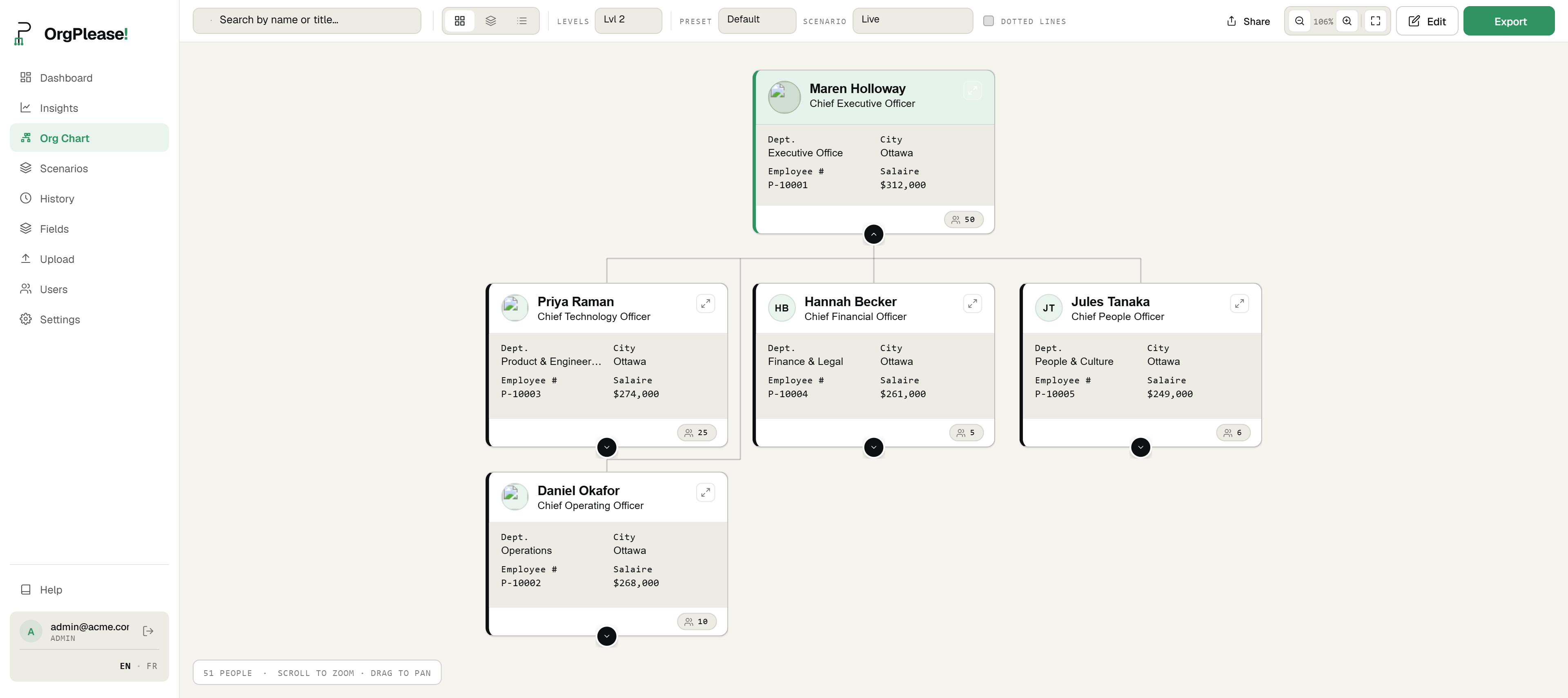
In OrgPlease the flow is short: upload your Excel or CSV roster, the chart builds itself from the manager-email column, and you open the Export menu and choose PowerPoint. What comes down is a real .pptx deck — one slide per page, laid out like the full chart — where each person is a native PowerPoint shape. No hand-drawing, no dragging boxes into place.
What "editable" actually means
This is the part worth being precise about, because "export to PowerPoint" can mean two very different things.
The common version is a flat image: the tool screenshots the chart and drops the picture onto a slide. You can move the picture, but you can't touch anything inside it. Change a title, recolor one team, fix a typo — you can't, because it's a single frozen graphic.
The OrgPlease export is the other kind. Every person is a real box you can select, move, resize, and restyle in PowerPoint, exactly like a shape you drew yourself — because as far as PowerPoint is concerned, it is one. Recolor a division to match your slide master, bump a font, pull one team onto its own slide, add a callout beside the CEO. It's your deck now; edit it like any other.
Dashed dotted-line (matrix) reporting carries into the export too — if someone has a secondary manager, that dashed connection shows up in the .pptx alongside the solid reporting lines, so the deck reflects how the org actually works.
Free vs. paid
PowerPoint export works on every plan, including the free one. The one difference is the watermark: free exports carry a small "Made with OrgPlease!" mark on the slides. Paid plans export clean — no watermark — and also carry your logo, custom title, and confidentiality label into the deck.
So you can try the whole thing end to end for free, right up to a finished editable deck, and decide whether it's worth upgrading to drop the mark before it goes in front of the board.
Step by step
- Upload your roster. Drop in an Excel or CSV file — Name, Email, and Manager's email are all it needs to build the hierarchy.
- Build the chart. OrgPlease reads the manager-email column and assembles the reporting structure automatically, in about a minute.
- Click Export, then PowerPoint. Open the Export menu and choose PowerPoint (.pptx).
- Open the editable .pptx. Open the downloaded file in PowerPoint — every person is a real shape, not a picture.
- Restyle or drop into your deck. Recolor and rearrange the shapes, or paste the slides straight into an existing deck.
One honest note on freshness: the chart is as current as your last roster upload — there's no live sync to your HR system. When the org changes, you re-upload the roster and export again. That's a feature as much as a limit: the same re-upload model means you're always exporting from one clean source of truth, not patching a slide by hand.
Bottom line
If your org chart has to live in PowerPoint, you don't have to draw it in PowerPoint. Generate it from the roster you already have, export a native, editable .pptx, and you get slides you can restyle and fold into any deck — with the reporting lines (dotted ones included) intact. Every plan can export; free adds a small watermark, paid strips it. It beats SmartArt the moment your team is more than a handful of people, and it stays that way every time the org changes.
Get an editable org chart into your deck. Free up to 25 employees — no credit card. Free exports carry a small watermark. Start your free org chart
Related reading: How to make an org chart from a CSV file · Free org chart maker from Excel · Org chart version history