Most org charts pretend everyone has exactly one boss. Real organizations rarely work that way. Someone sits on the marketing team but takes day-to-day direction from a project lead. A data analyst reports to their functional manager but is embedded with a product squad. Shared services — legal, finance, IT — answer to a department head while also serving the business units they support. On a plain top-down tree, all of that context is invisible.
The convention for showing it is the dotted line: a solid line to your primary manager, and a dashed line to a second one. This guide covers what dotted-line (matrix) reporting is, when you actually need it, and how to add it to a chart in OrgPlease so it shows on screen and carries into your exports.
What dotted-line and matrix reporting is
A solid-line manager is the one who owns your role — the person who hires, sets your objectives, does your review, and signs off on your time. That relationship is what a normal org chart draws, and it's what the reporting hierarchy is built from.
A dotted-line manager is a secondary reporting relationship. You're accountable to them for some part of your work, but they're not your primary manager. The line is drawn dashed rather than solid precisely to signal "this is real, but it's the secondary one." When an organization has enough of these relationships that people routinely answer to two managers, it's usually called a matrix — functional managers down one axis, project or business-unit leads across the other.
The distinction matters on a chart because a single tree can only show one parent per person. Dotted lines are how you add the second relationship without breaking the tree.
When you actually need it
Not every org needs dotted lines, and adding them where they don't belong just clutters the picture. You need them when a real, ongoing second relationship exists that people would otherwise miss. Common cases:
- Project and program leads — someone stays in their home team but is directed day-to-day by whoever runs the initiative they're staffed on.
- Shared services — a finance business partner, an HR partner, or an IT lead who sits in a central function but effectively serves a specific division.
- Embedded specialists — a designer or analyst who reports to a functional manager for their craft but works inside another team's day-to-day.
- Interim or transitional coverage — a manager temporarily overseeing a team that isn't formally theirs.
The test is simple: if the second relationship is real enough that a new hire would be confused without it, put it on the chart. If it's a one-off or a nice-to-know, leave it off.
How to add it in OrgPlease
In OrgPlease, a dotted line is just a secondary manager set on a person — alongside the primary manager that builds the tree. There are two ways to set it.
On the chart: open Edit, click the person's card, and pick a Secondary manager. That's it — the dashed line and the badge appear immediately.
On import: add a Secondary Supervisor Email column to your spreadsheet, next to the regular manager-email column, and point it at the second manager's email. When you upload, OrgPlease reads both — the primary email builds the hierarchy, and the secondary email becomes the dotted line. It's the same idea as the manager-email column that defines the tree, just for the second relationship. One person can have one primary manager and one dotted-line manager.
How it shows on the chart
Dotted-line relationships are visible without turning the chart into a plate of spaghetti. Three things work together:
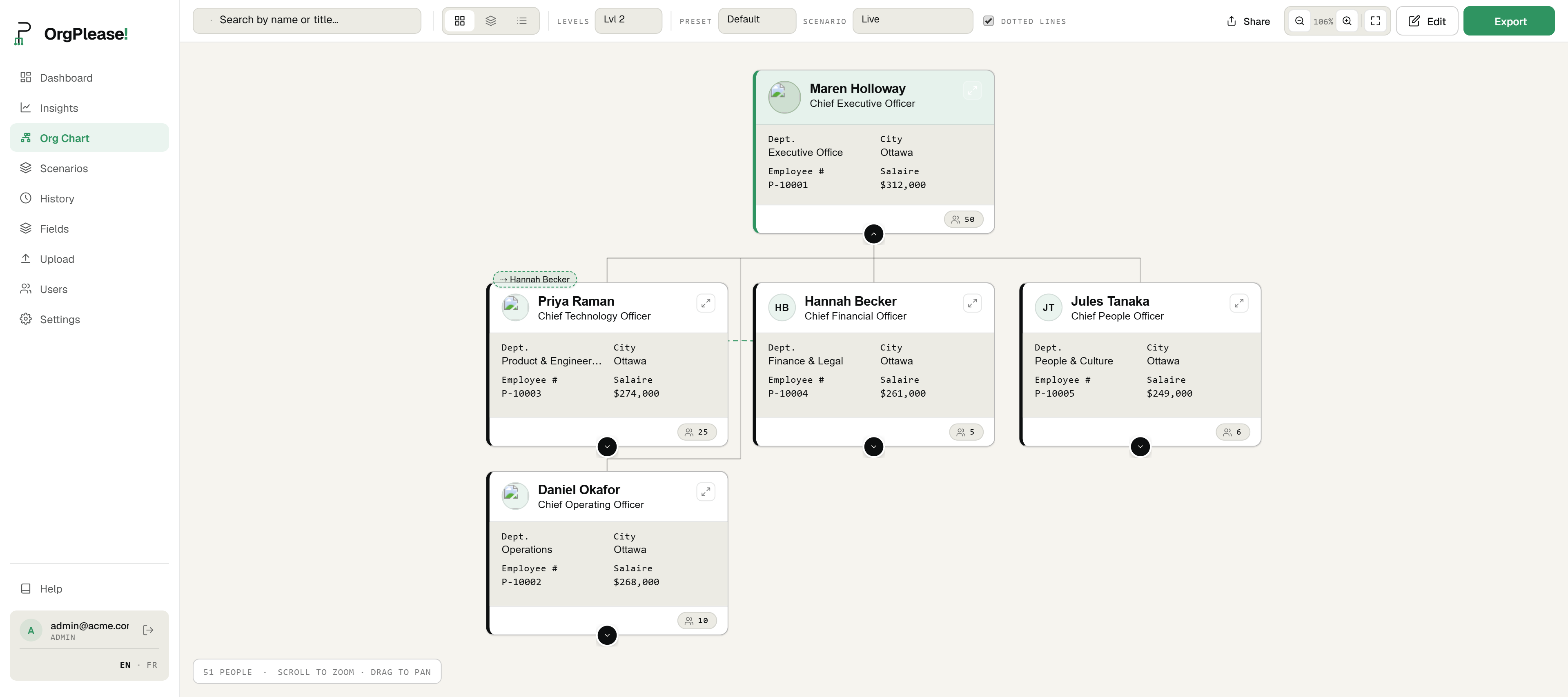
- An on-card badge. Anyone with a dotted-line manager shows a small ⇢ badge on their card, naming that manager. So even with every dashed line hidden, you can see at a glance who has a second reporting line and to whom.
- A toggle to show them all. Flip the Dotted lines switch in the toolbar and every dotted-line connection draws across the chart as a dashed curve. Useful when you want the full matrix in one view.
- Hover to reveal one. With the toggle off, hover any card and just that person's dotted line appears; move away and it hides again. That lets you check a single relationship without the clutter of all of them at once.
The badge is the always-on signal; the toggle and hover are for when you want to trace the actual lines.
It carries into your exports
A reporting relationship that only exists on your screen isn't much use when you have to hand the chart to someone. Dotted lines carry through to both your PDF and PowerPoint exports, drawn as dashed connectors just like on screen — so the matrix structure shows up in the board deck, the onboarding pack, or whatever you print. In the PowerPoint export, those dashed connections come across as real shapes on the slide, not a flattened picture, so you can keep editing them alongside everything else.
Which plan you need
Dotted-line reporting is available on Starter and above — that's the $19/mo plan and up. On the Free plan the feature is shown but locked, so you can see where it lives before deciding to upgrade. If your org is genuinely matrixed, it's usually the reason to move off Free.
One honest limit
OrgPlease builds the chart from the roster you upload, not from a live HR feed. So a dotted line is as current as your last upload — when a project ends or a second relationship changes, you update the person (on the chart or in the spreadsheet) and it's reflected. There's no background sync pretending to keep it live; you're always looking at the version you last set.
Bottom line
If people in your organization answer to more than one manager, a plain tree is telling a half-truth. Dotted-line reporting adds the second relationship as a dashed line and an on-card badge, you set it in a click or an extra spreadsheet column, and it follows the chart into your PDF and PowerPoint exports. It's a Starter feature — shown but locked on Free.
Chart the reporting lines that actually exist. Try OrgPlease! free up to 25 people — no credit card. Start your free org chart
Related reading: Export an org chart to PowerPoint · Org chart scenario planning
Restructuring the matrix? Model the change on a private copy first with scenario planning, then publish when it's right.