For most companies between 20 and 200 people, a healthy span of control is 3 to 7 direct reports per manager. Past 8, something usually starts to give. Past 12, the manager is a bottleneck with a title.
That is the short answer, and if you came here from a search box, you can stop reading now. The rest of this post is for the person who has to defend a number in a meeting: where those thresholds come from, the other ratio almost nobody checks, the six shapes a struggling chart takes, and a 10-minute audit you can run on the spreadsheet you already have.
One disclosure before the numbers. We make org chart software (OrgPlease!), and the thresholds below are the exact defaults our org health engine ships with. That cuts both ways: we are biased, and we also had to commit to real numbers in working code instead of hedging like a consulting deck. This post shows you those numbers so you can use them without our product.
Where the numbers come from, honestly
Span of control is one of the oldest questions in management, and most writing about it refuses to answer it. You get "it depends" in a thousand words.
It does depend. But when we built the health engine that scores every chart uploaded to OrgPlease, "it depends" was not an option. Code needs constants. So we picked defaults we were prepared to defend, and after watching them run against real org charts, we still defend them:
- A span above 8 gets flagged. Above 12 it is flagged as severe.
- An average span below 3 reads as top-heavy: too many managers managing too few people.
- A manager ratio above 40% of headcount gets flagged.
- A chart deeper than 6 levels gets flagged, whatever the spans look like.
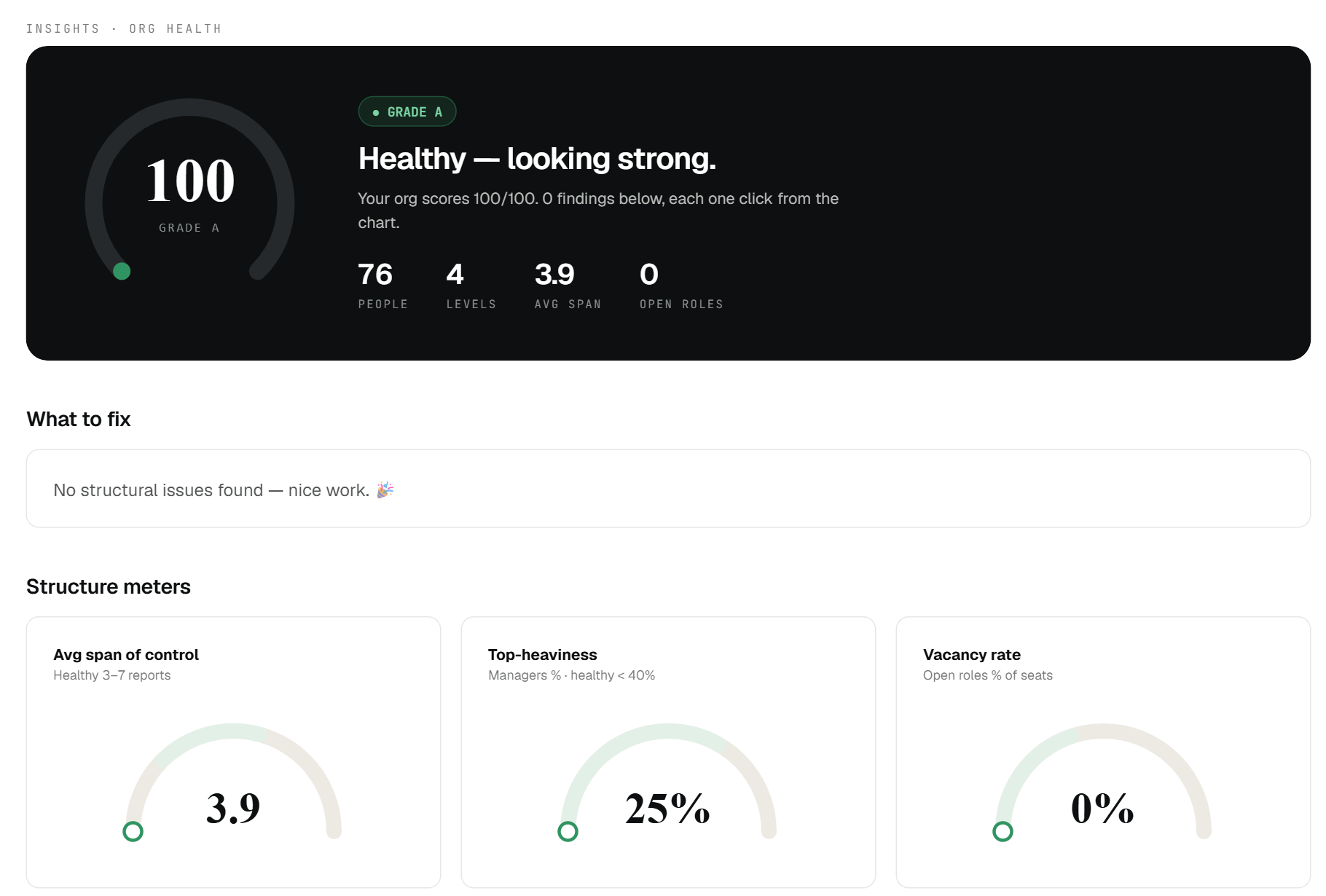
That is the report those constants power, run against our 76-person sample company: average span 3.9, manager ratio 25%, zero findings. The meters carry the thresholds right in their labels.
The healthy band those constants imply is the one in the first paragraph: 3 to 7 reports for most managers, with 8 as the edge of normal rather than the middle of it.
Treat these as defaults, the way your thermostat has a default. The right span for a specific team moves with the work, and we will get to the honest exceptions below. But defaults beat vibes, and if a manager in your company carries 11 reports, "it depends" is not a plan.
The manager ratio: the number almost nobody checks
Everyone asks about individual spans. Almost nobody divides managers by headcount, and that ratio catches problems the spans hide.
Here is the trap. A company can have every individual span inside the healthy band and still be drowning in management. Ten managers with three reports each looks fine manager by manager. But that is 10 managers in a company of 40, a 25% ratio already, and if a few of those managers slip to one or two reports, the average span sinks while the org chart quietly fills with coordinators.
Our engine draws the line at 40%. Above that, or with an average span under 3, the chart gets a top-heavy finding, and the day-to-day version of that finding is familiar: meetings about meetings, three approvals for a $200 expense, and ICs who spend Friday writing updates for layers that exist mainly to read them.
Under 40% is not a badge either. It is just the point past which coordination starts crowding out the work.
The six shapes of a struggling chart
Wide spans are only one failure mode. When our engine scores a chart, it looks for six shapes, and each has a symptom you can feel before you ever count anything.
1. The wide span. A manager with more than 8 reports (severe past 12). Symptom: 1:1s slip to biweekly, then monthly. Interviews get rescheduled twice. Decisions queue behind one calendar.
2. The thin layer. A manager with exactly one report. A full reporting relationship, with all its meetings, spent on one person. Usually a title left over from an old structure.
3. The fragile ladder. Two or more managers-of-one stacked in a chain. Each link adds a hop and no capacity, and one resignation snaps the whole run.
4. Too deep. More than 6 levels top to bottom. Every level is a retelling, and by level seven the front line is hearing a rumor of the strategy.
5. Top-heavy. The ratio problem from the last section: managers above 40% of headcount, or an average span under 3.
6. Orphans. Someone's manager is listed but does not exist in the roster. This one is a data bug rather than a design choice, and it is worth catching because orphaned people silently vanish from reporting views.
If you recognize your company in two or more of these, the fix is rarely "work harder." It is structural, and the reorg post below covers how to plan that fix without breaking what works.
The 10-minute self-audit
You need no software for this, just the roster spreadsheet you probably already keep (name, email, manager's email). If you keep it in the shape of our free org chart template, the columns are already right.
1. Count each manager's span (4 minutes). Next to each person, count how many rows list their email as the manager. In Excel or Google Sheets, with emails in column B and manager emails in column C, put this in a new column and fill it down:
=COUNTIF(C:C, B2)
Anyone with a result above 0 is a manager, and the number is their span. Sort descending and look at the top. Anything above 8 is your flag list.
2. Compute the manager ratio (3 minutes). Copy the manager email column to a blank sheet and run Remove Duplicates. The rows that remain are your managers. Divide by total headcount. Above 40% deserves a conversation.
3. Check the depth (3 minutes). Start from the person at the top and follow the longest chain down, counting levels. Past 6, ask what each level actually decides.
Write the three numbers down with the date. The audit is more useful the second time you run it, because the direction of drift matters more than any single reading.
When a wide span of control is fine
Here is the section that keeps the thresholds honest, because a default is not a law.
A span of 9 or 10 can work well when the work is similar and repeatable (a support team running one queue), when the reports are senior people who mostly need context rather than supervision, and when the operating rhythm is strong: written weekly updates, a real team meeting, decisions documented where everyone can see them. A seasoned support lead with 10 agents on one workflow is a healthier structure than a new manager with 5 reports across 5 unrelated projects.
The reverse is also true. Narrow spans are fine, and often right, during a ramp: a brand-new manager learning with 2 reports, or an apprenticeship structure where the point is teaching. The thin layer becomes a problem when it fossilizes, when the manager-of-one is still a manager-of-one two years later.
The threshold's job is to make you look. What you decide after looking is judgment, and no engine replaces that.
Bottom line
3 to 7 reports per manager, a manager ratio under 40%, no more than 6 levels. Defaults, stated plainly, that you can check against your own roster in 10 minutes with a COUNTIF and a Remove Duplicates.
If you would rather have the counting done for you: OrgPlease! runs this exact analysis on every chart automatically. Upload a roster and the org health report scores the structure out of 100 and names its findings, wide spans and fragile ladders included, using the same thresholds you just read. It is free up to 25 employees. But the numbers above work fine in a spreadsheet, and an audit you run yourself is one you will trust.
See your org's health score. Upload your roster, get a living chart plus a structural health report in about 60 seconds. Free up to 25 people. Start your free org chart
Related reading: Lire cet article en français · How to plan a reorg without breaking the org you have · Org chart scenario planning · Org chart template: free download